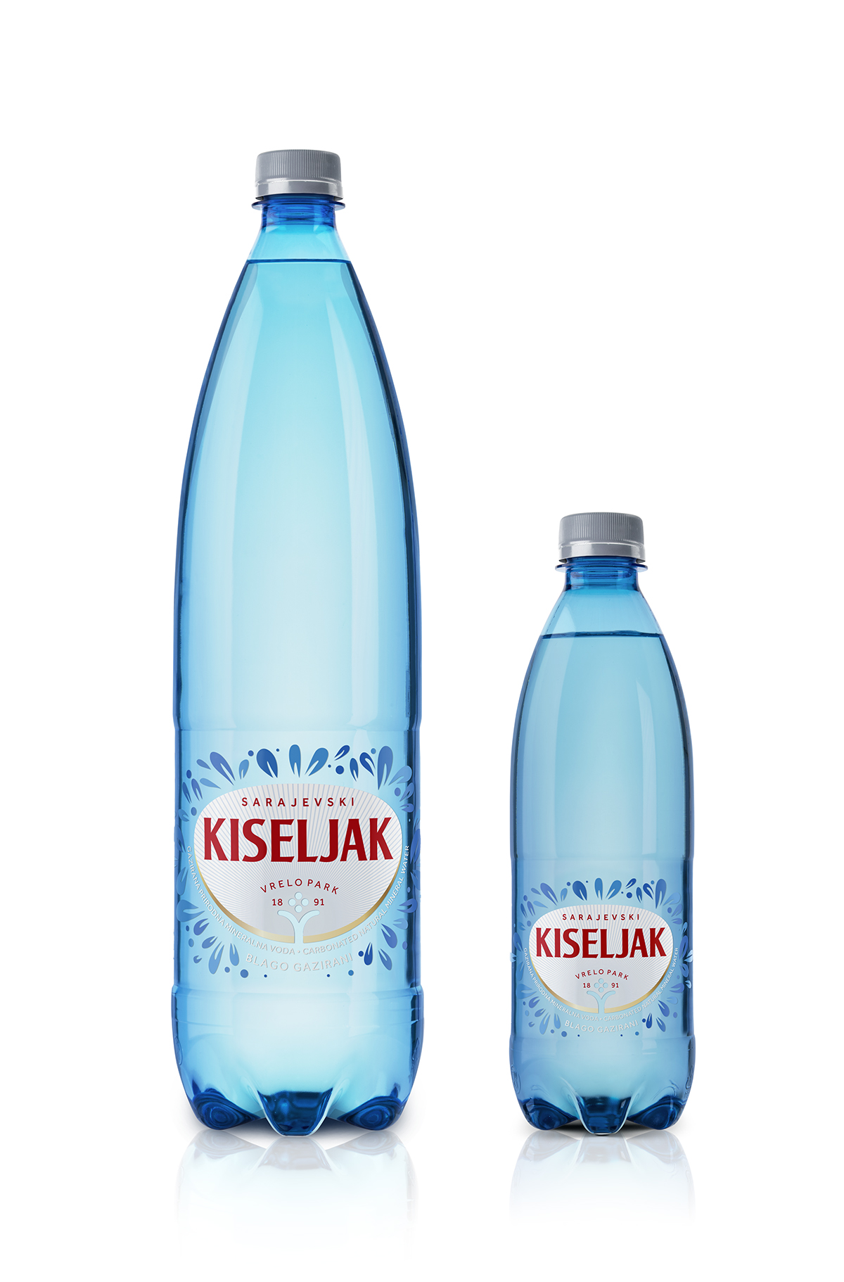
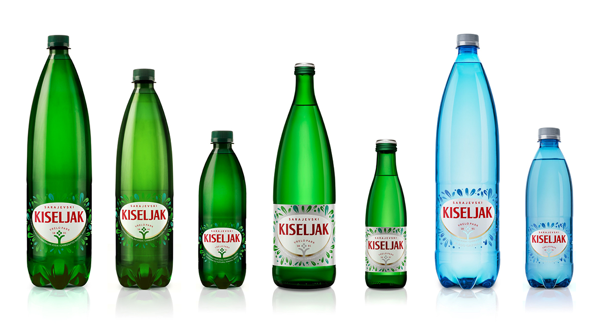
Client: Sarajevski kiseljak, Bosnia and Herzegovina
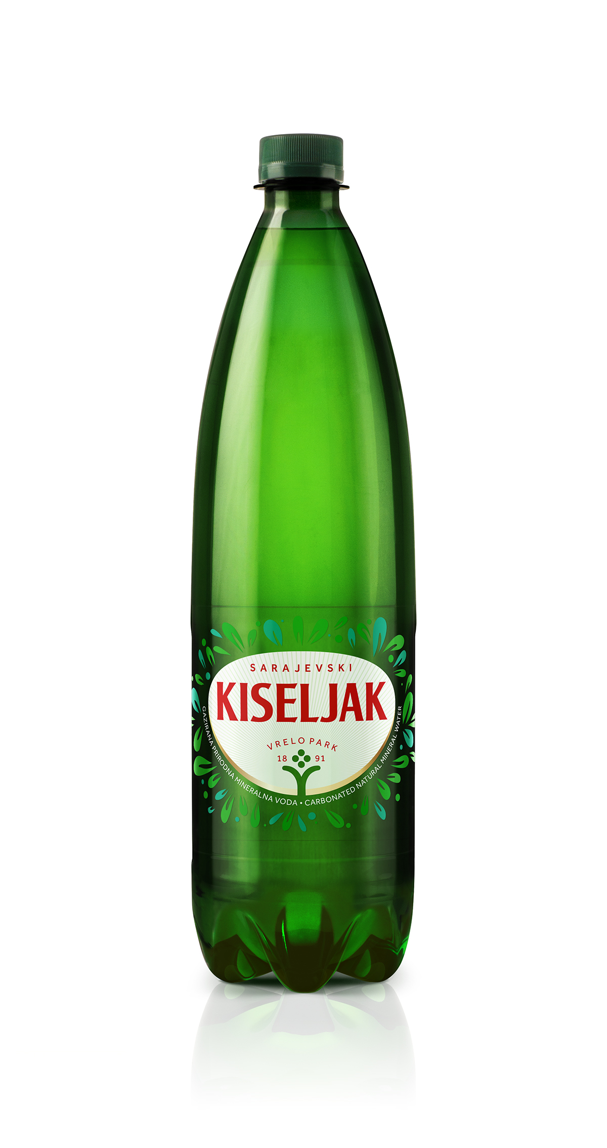
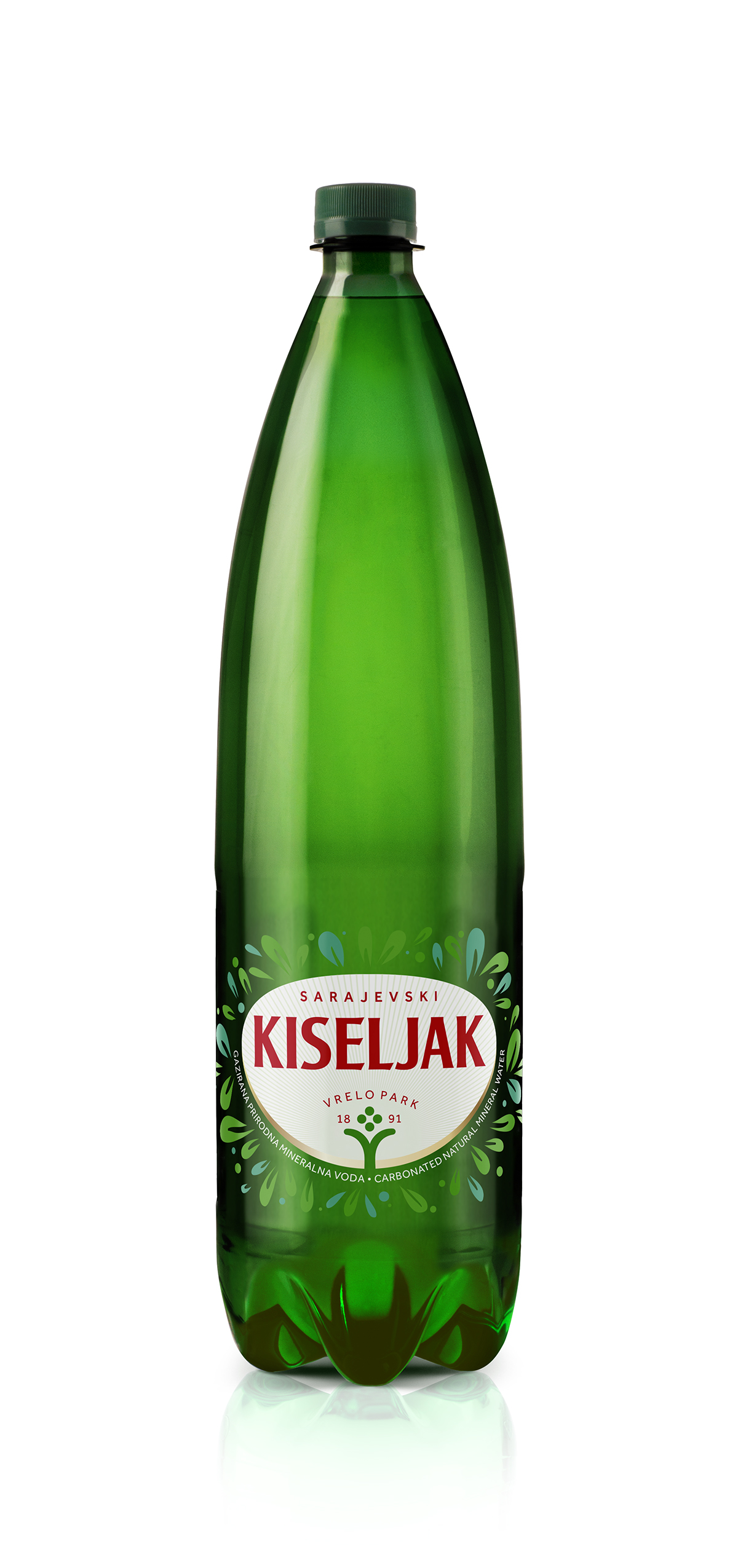
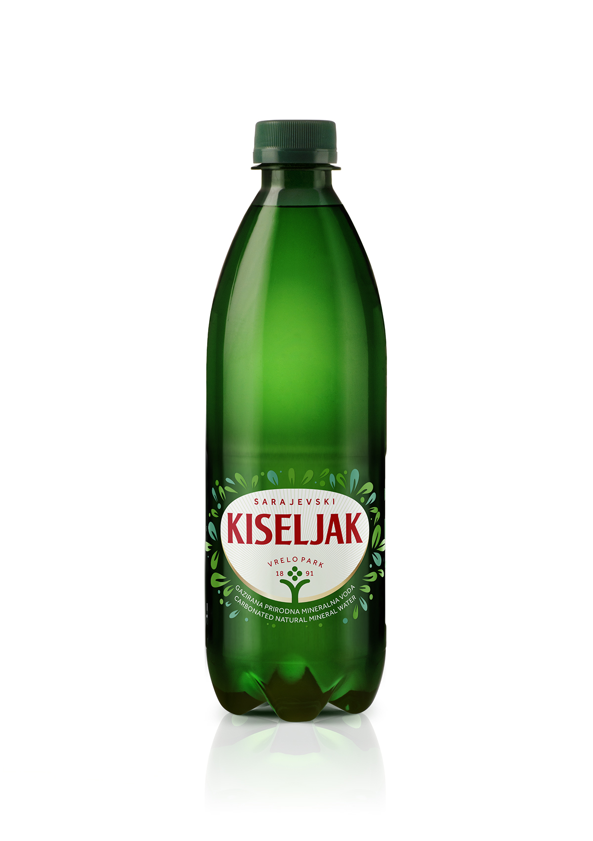
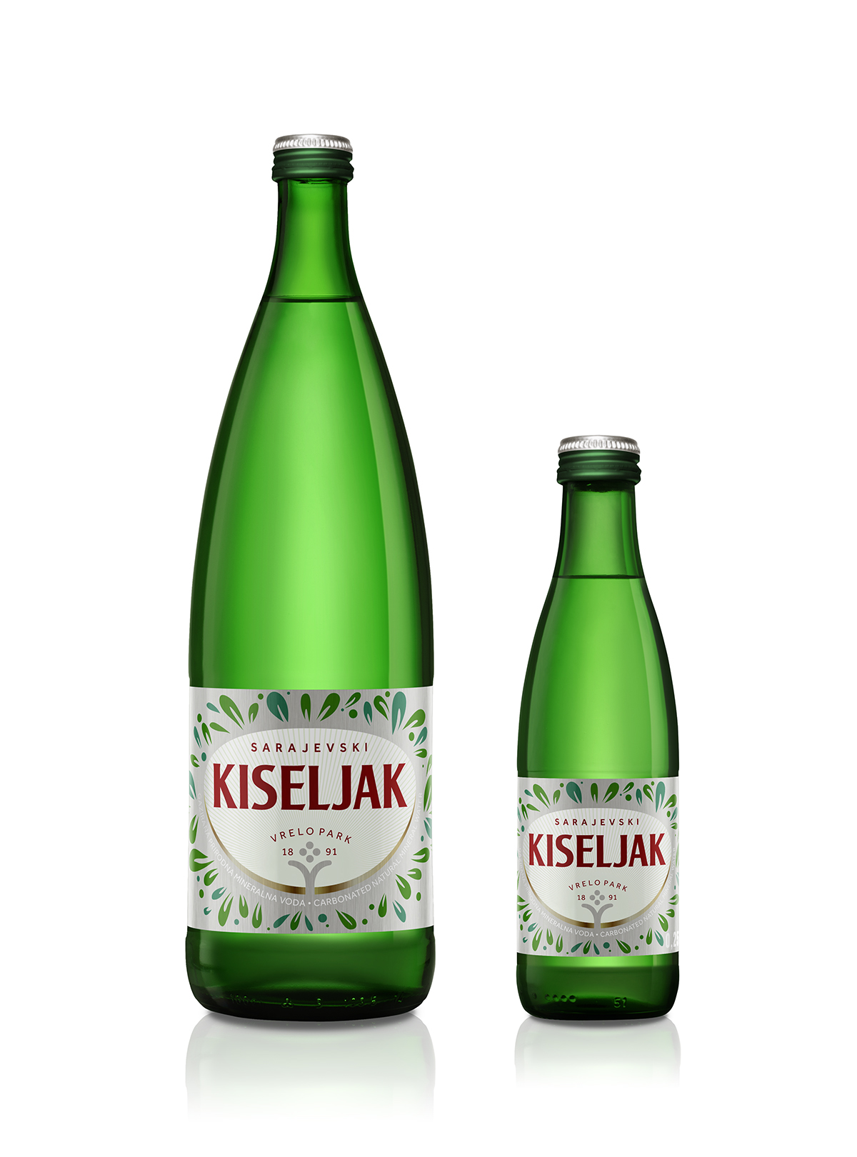
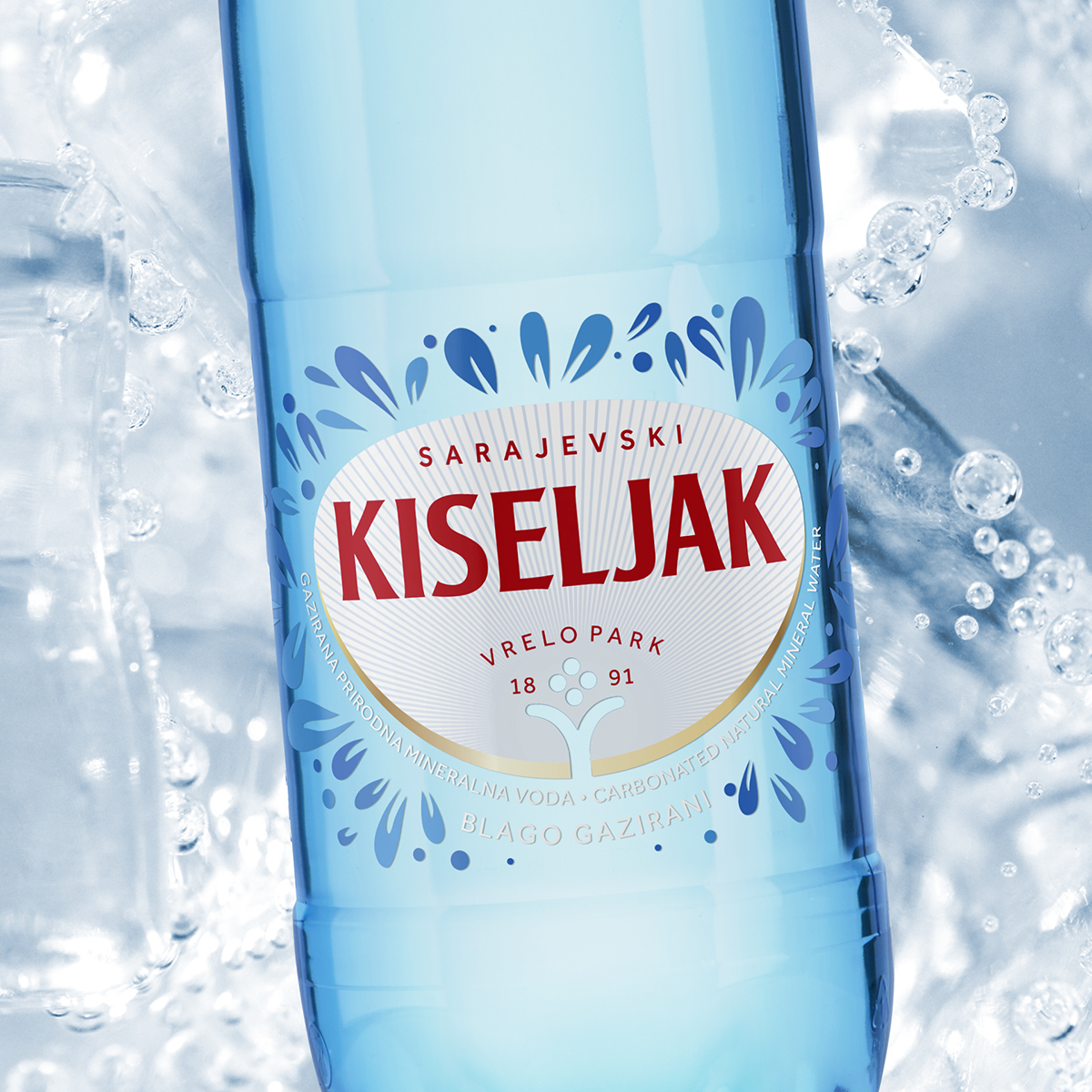
Sarajevski kiseljak invited us to redesign their most famous products’ visual identity and packaging: naturally carbonated mineral water and mildly carbonated natural mineral water. We had to keep the form of the packaging and adapt the design to the existing formats, which was a limiting factor, but we created proposals for solutions that fit into the given forms. We decided to simplify the visual identity of Sarajevo sorrel and reduce it to a cleaner form that allows us more apparent recognition, visibility, and more straightforward application. We have placed it in an oval shape that will enable us to apply the identity smoothly regardless of the background color, shape, or size. It also allows us good visibility, clearly communicates the brand identity, and allows us to share other relevant information (source location and year of existence).
The graphic in three different shades of green symbolizes the multitude of playful drops and the wealth of minerals with which we want to show the feeling and explosion of satisfaction and refreshment that each sip of Sarajevo sorrel brings. We have entirely simplified the graphic identity of the source. We have presented it in a pictogram format and thus brought it closer to the desired target groups.