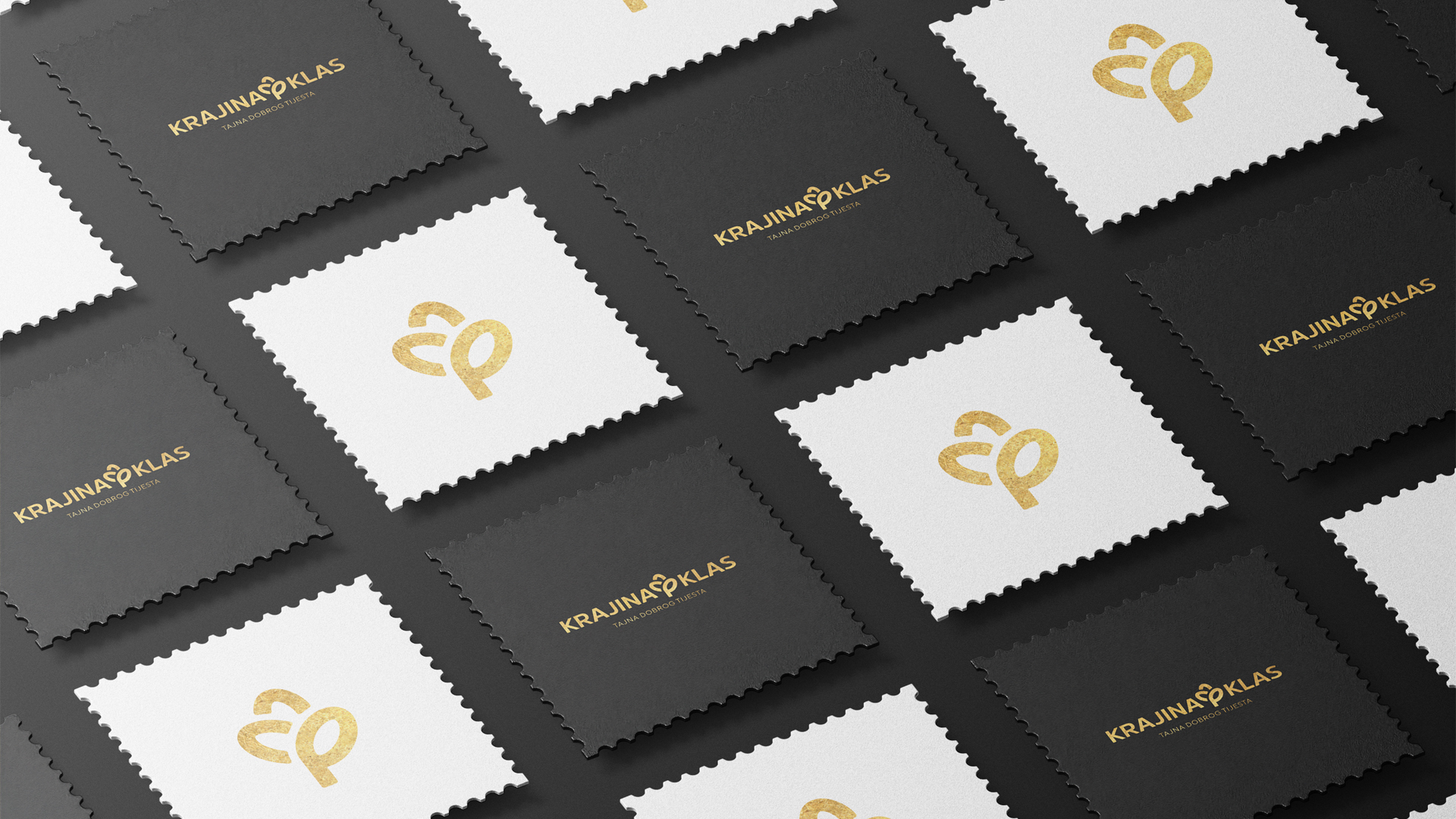
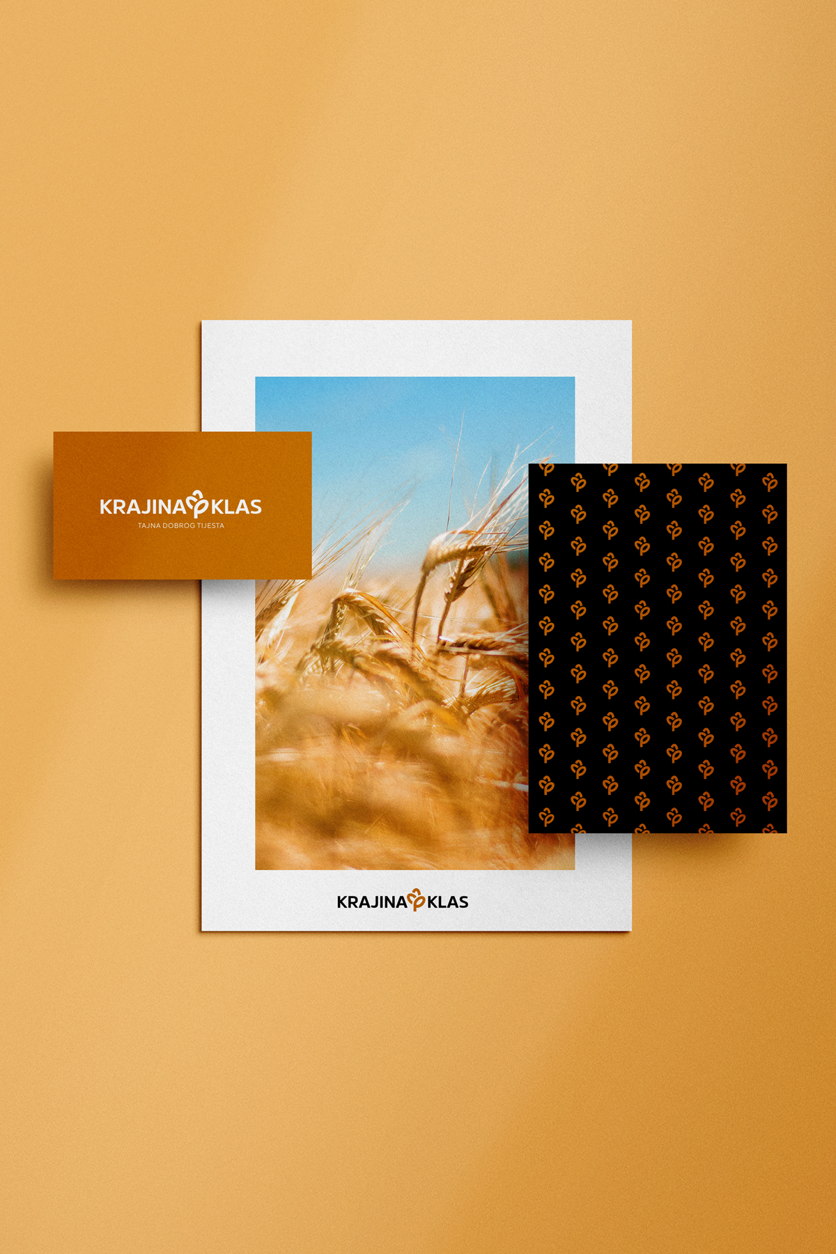
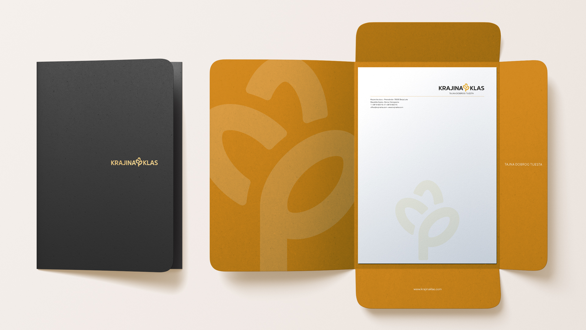
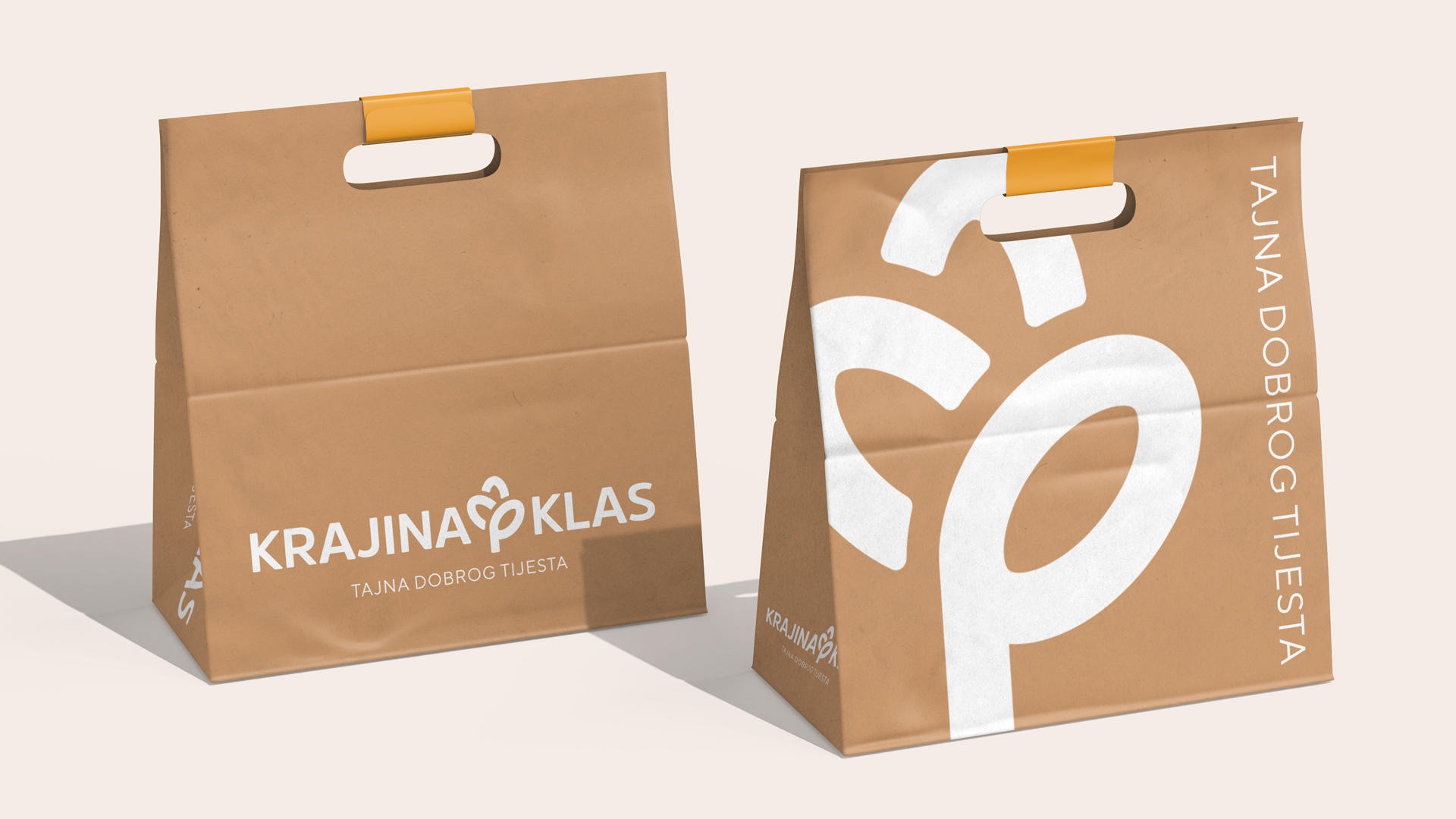
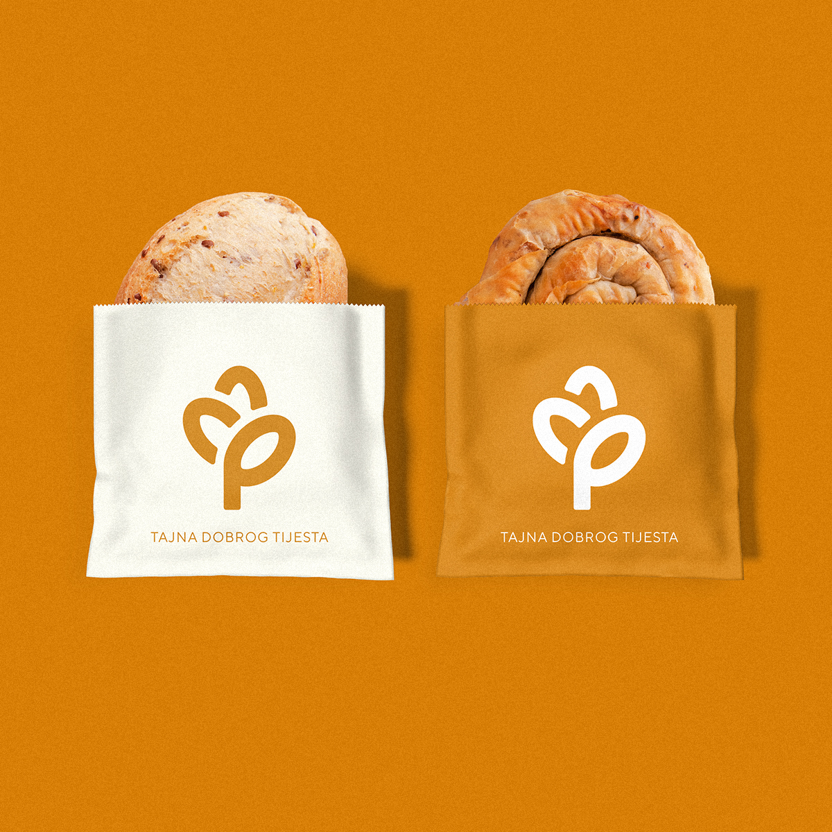
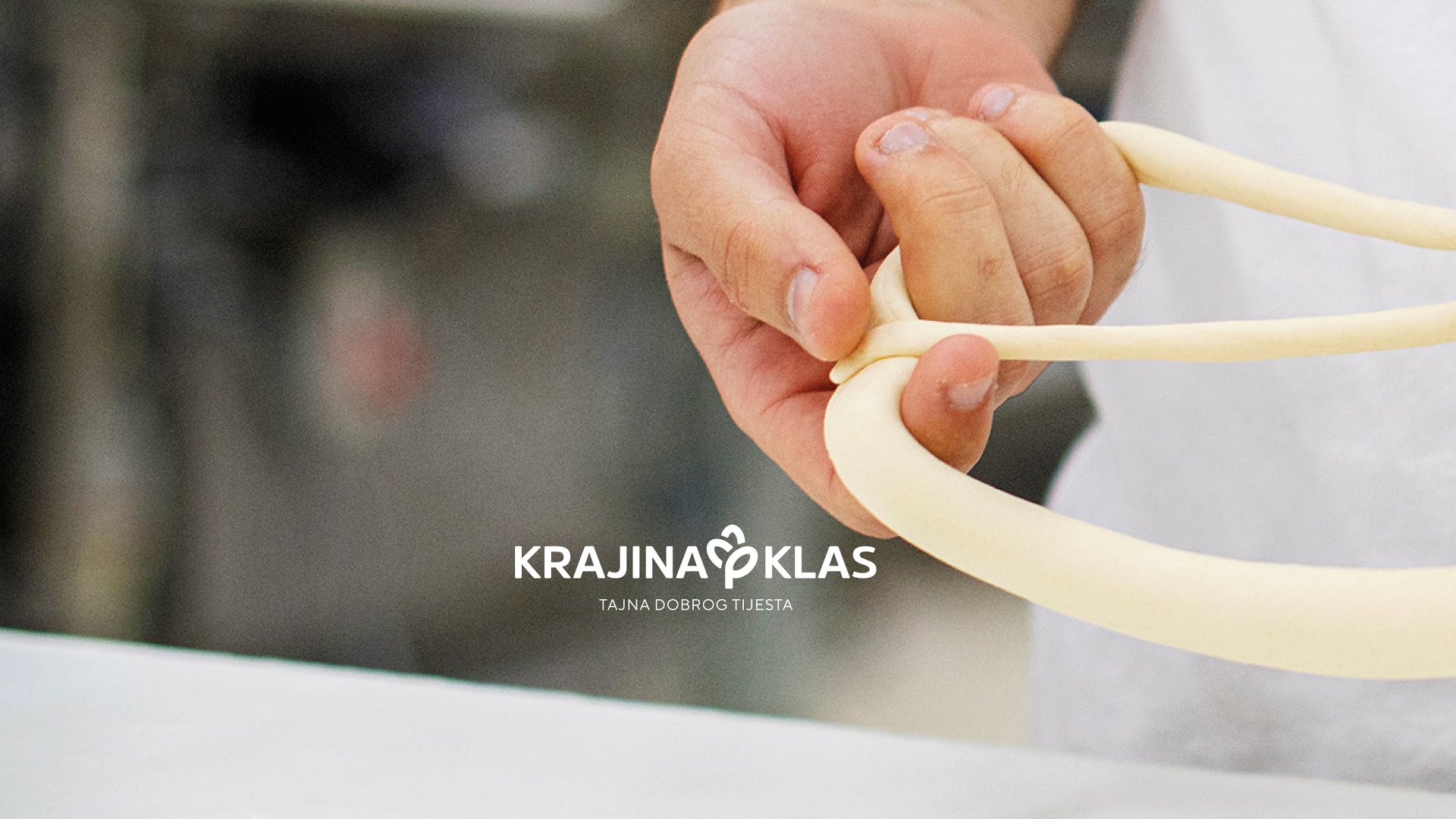
The visual identity of the company Krajina Klas was designed as a potent symbol of connection with tradition, nature and the basis of the bakery industry – the grain of wheat. The central motif of the logo is derived from the stylised shape of a grain, which makes it recognisable, modern, and at the same time subtly rustic and emotionally connected to the brand’s core values: quality, tradition, and naturalness.
The warm, golden-brown colour symbolises ripe grain, the sun, and homemade bread, while the very form of the logo communicates modernity and reliability through modern, rounded lines. By combining simplicity and symbolism, the new identity effectively conveys the message of a brand that respects tradition while also building the future through innovation and top-quality production.
The slogan “The Secret of Fine Dough” further emphasises the commitment to the essence of the bakery craft—precisely selected ingredients, knowledge passed down through generations, and a constant improvement of the production process. The identity and slogan together communicate what Krajina Klas is: a reliable partner in the daily preparation of bread and pastries, those that smell of home and quality.
This redesign brings clarity, authenticity and emotional warmth – values that make Krajina Klas a recognisable name in the bakery industry.
