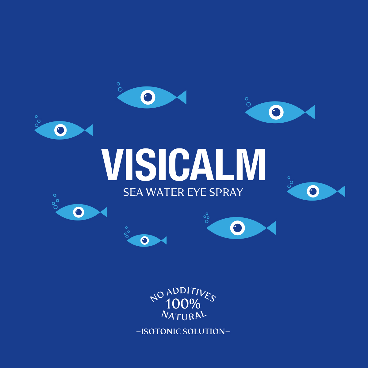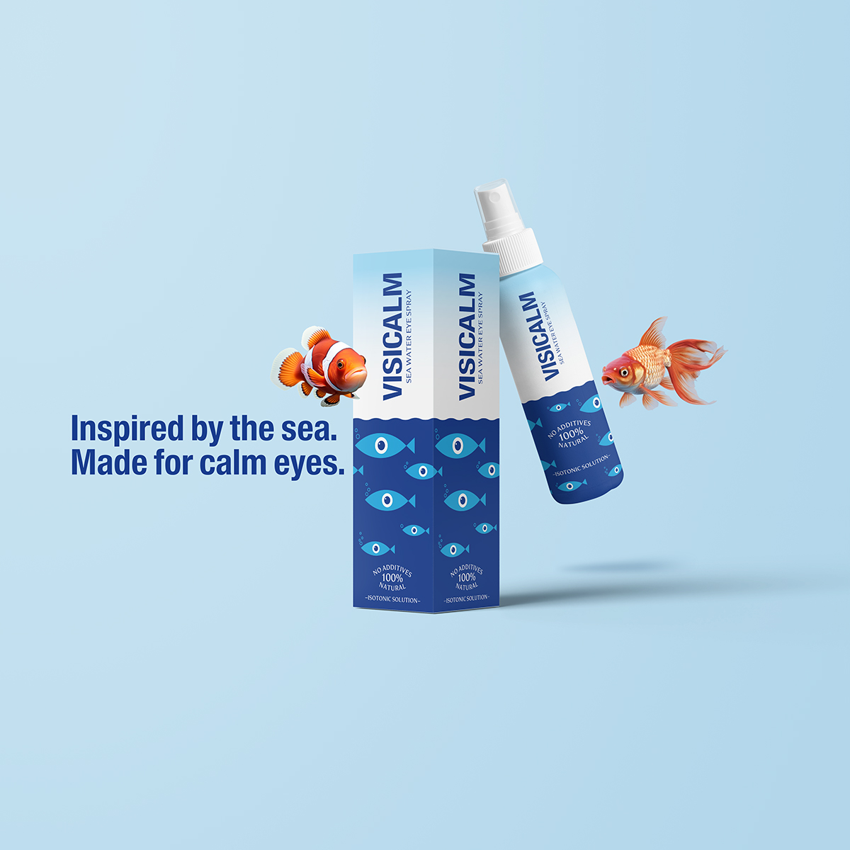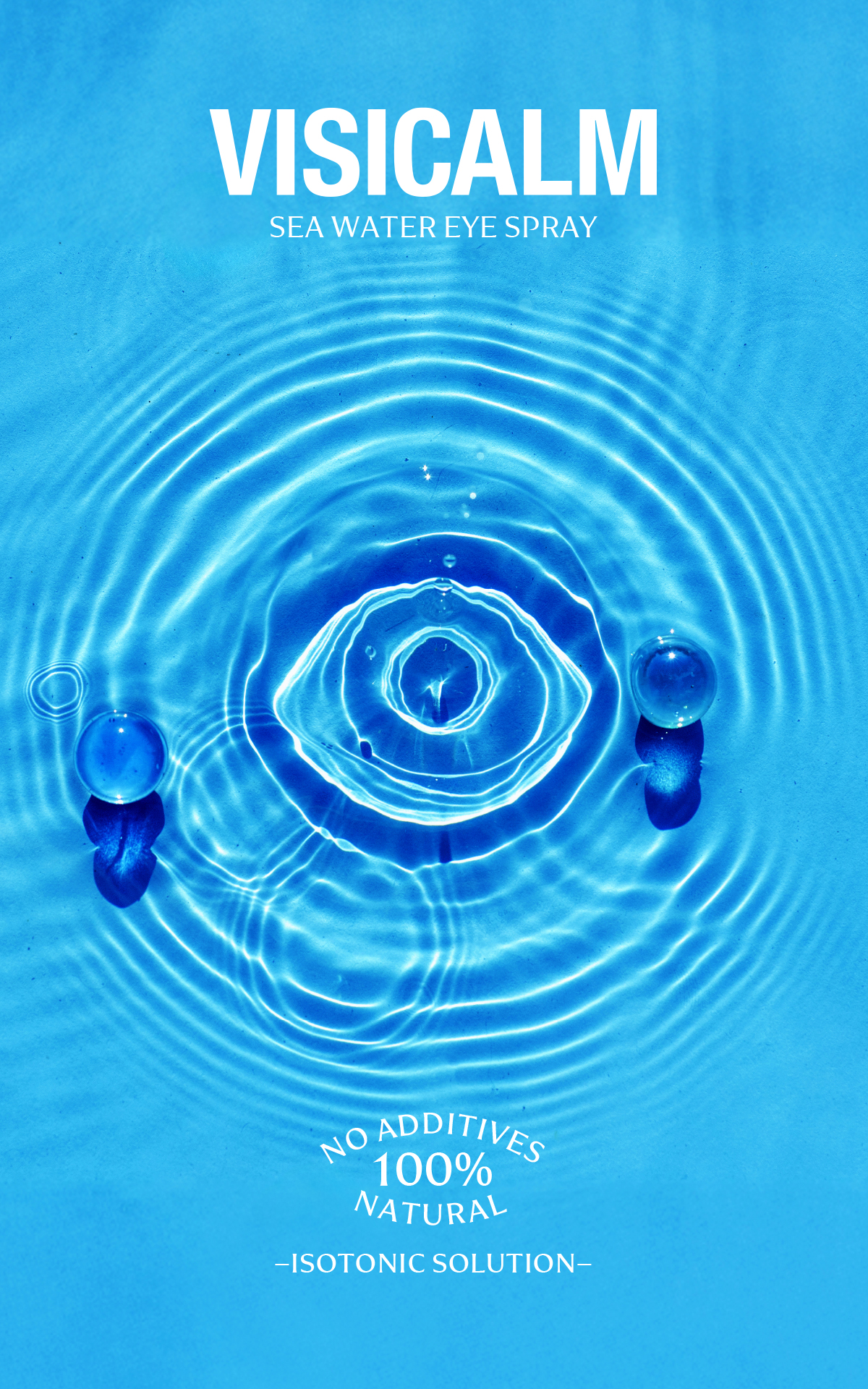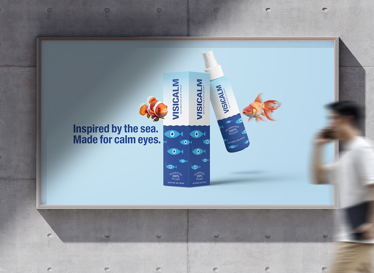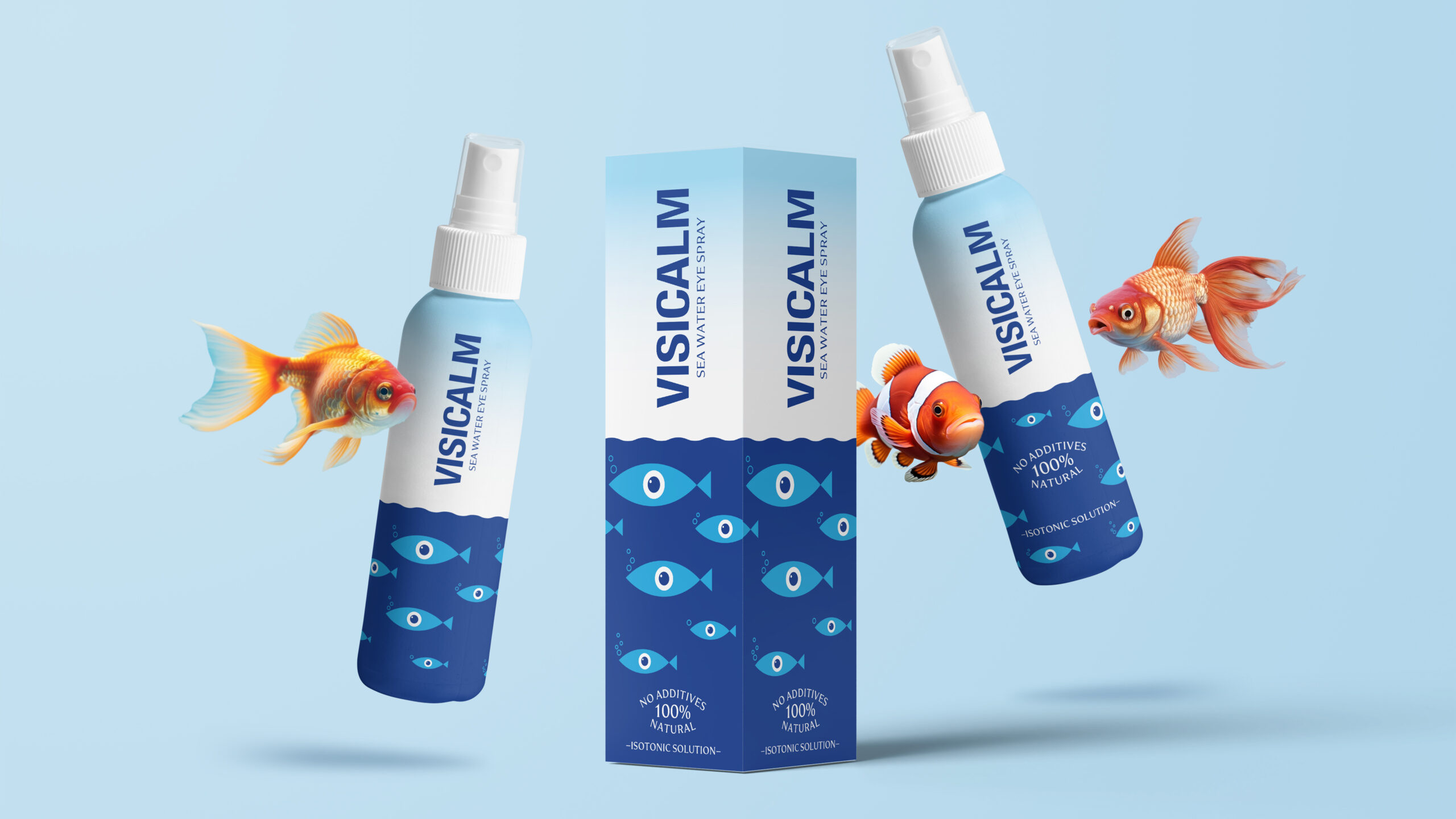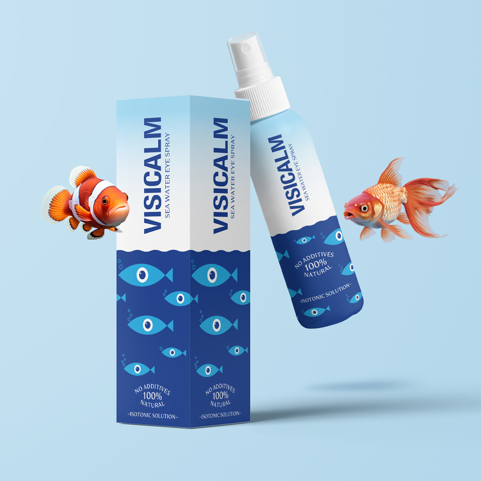
VisiCalm is designed as a gentle, natural solution for soothing eye irritation and relieving the symptoms of dry eye syndrome. Based on sea water, free from additives and entirely natural, VisiCalm restores a sense of balance where it is needed most – in the eyes.
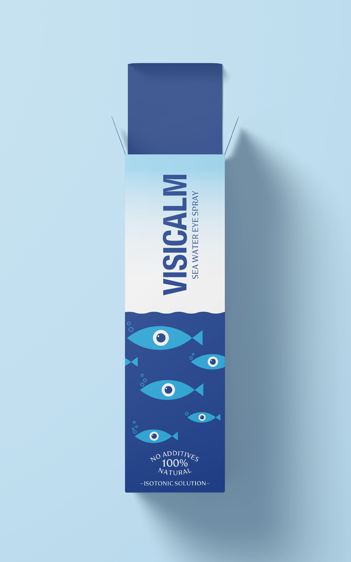
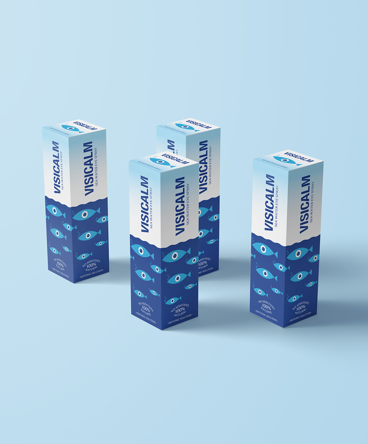
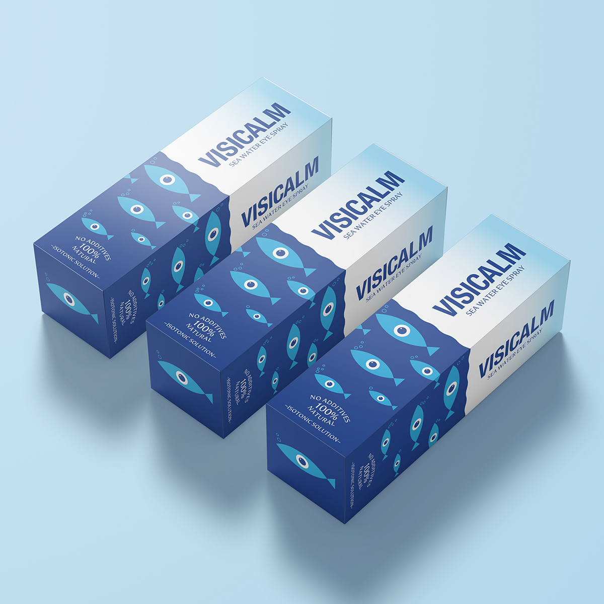
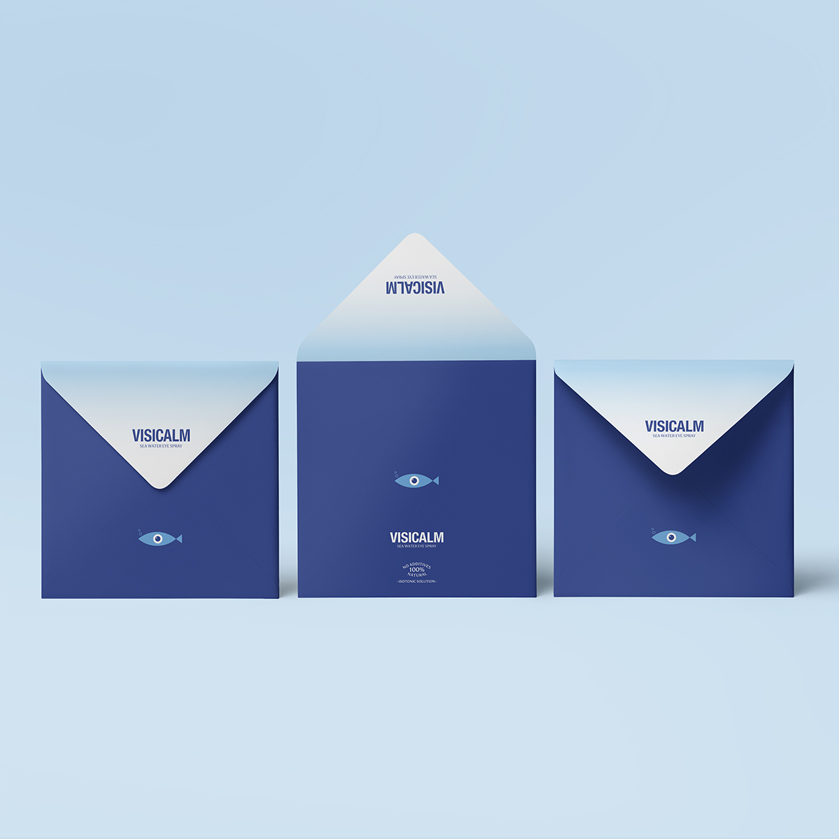
The visual identity is built around a simple yet powerful metaphor: an eye represented in the form of a fish. This symbol simultaneously refers to the product’s origin and its function, uniting the sea, purity, and vision into a clear and instantly recognizable graphic sign. Playful yet unobtrusive, the mark communicates the essence of the product without the need for explanation.
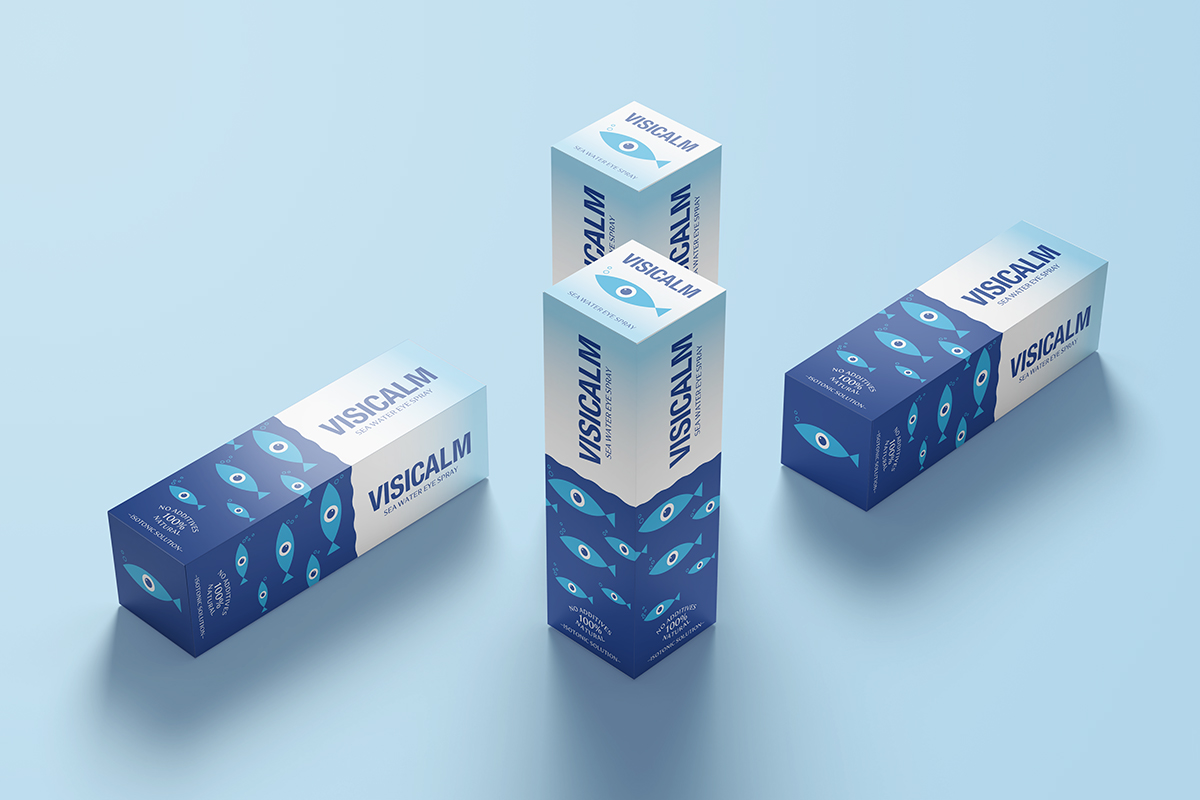
Clean typography, a calm blue color palette, and repeating graphic patterns create a feeling of freshness, trust, and simplicity. The packaging – consisting of a spray bottle and a cardboard box – is designed to feel medically precise while remaining visually warm and approachable.
VisiCalm does not speak loudly through its visual language. Instead, like the sea that inspires it, it communicates calm, balance, and natural strength – offering quiet relief to the eye.