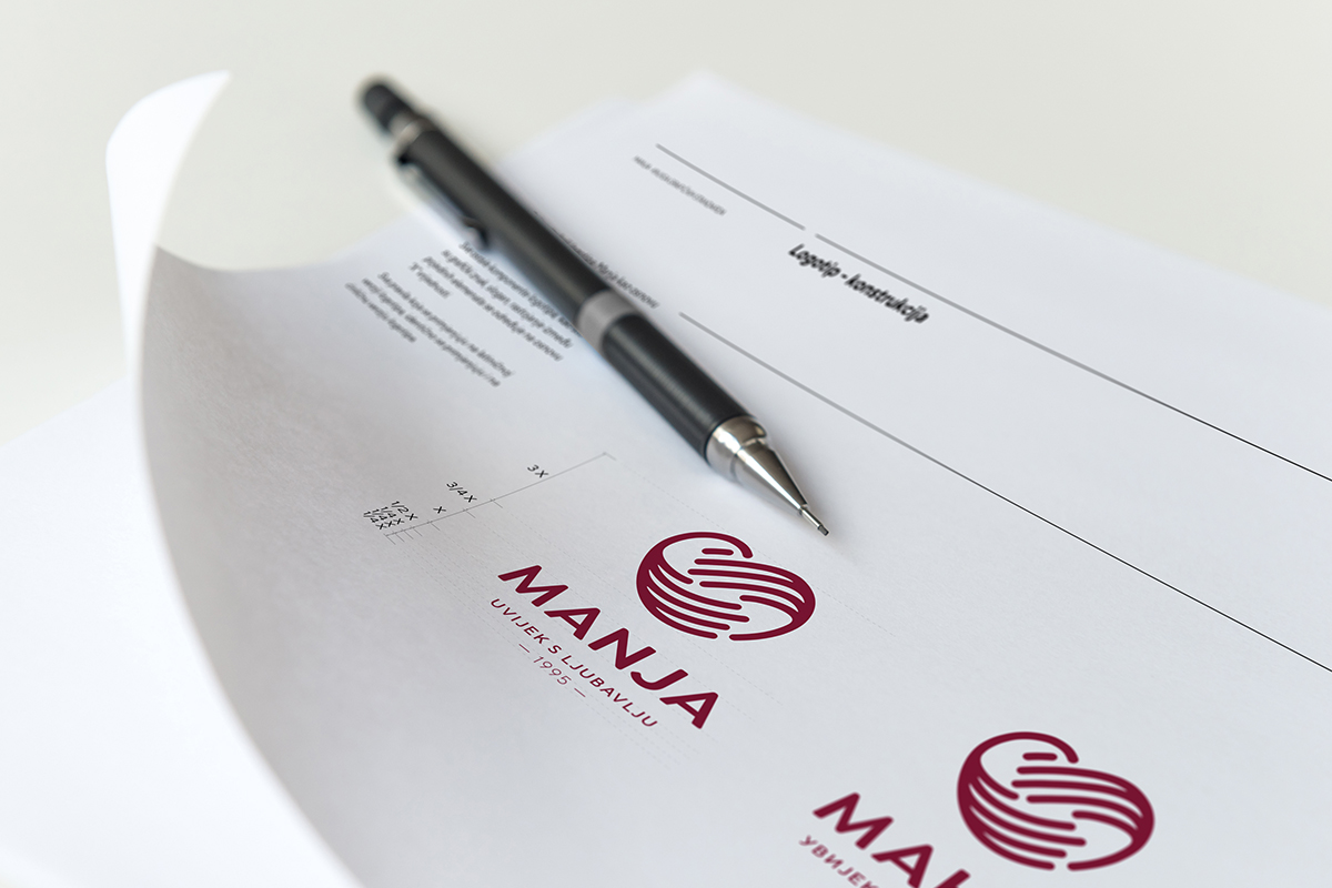
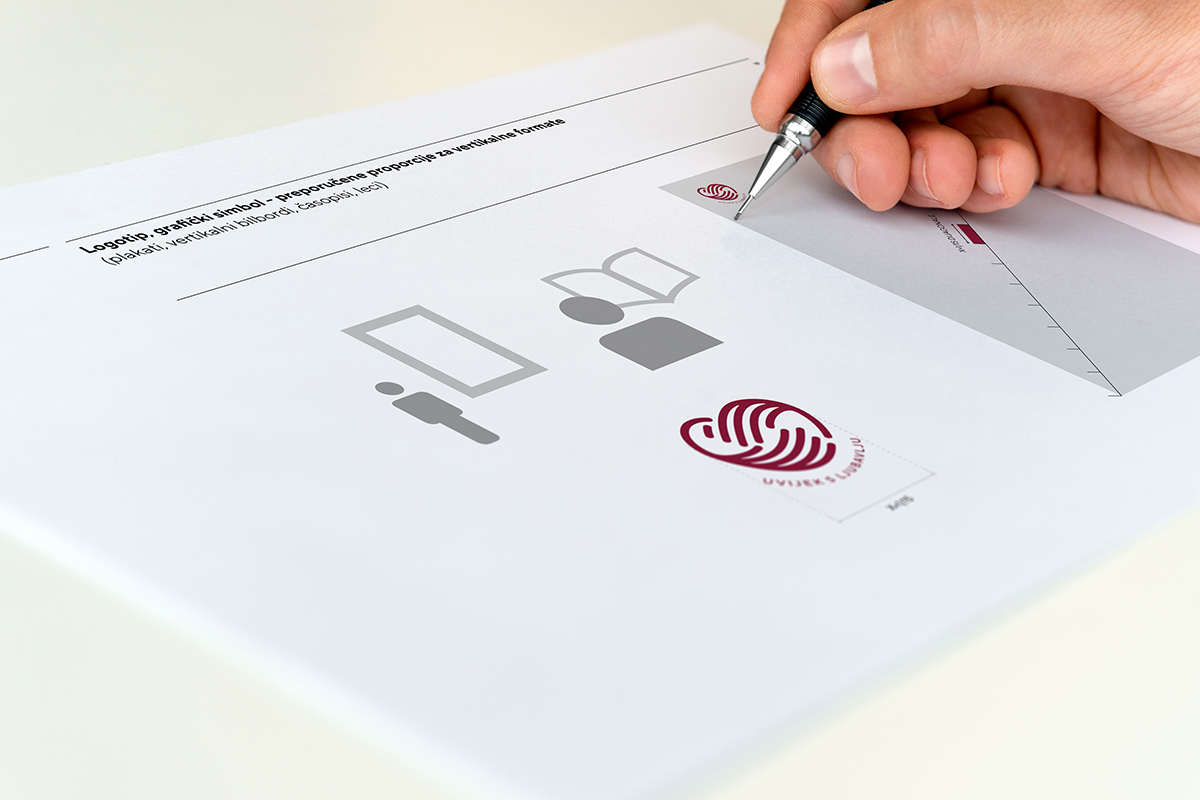
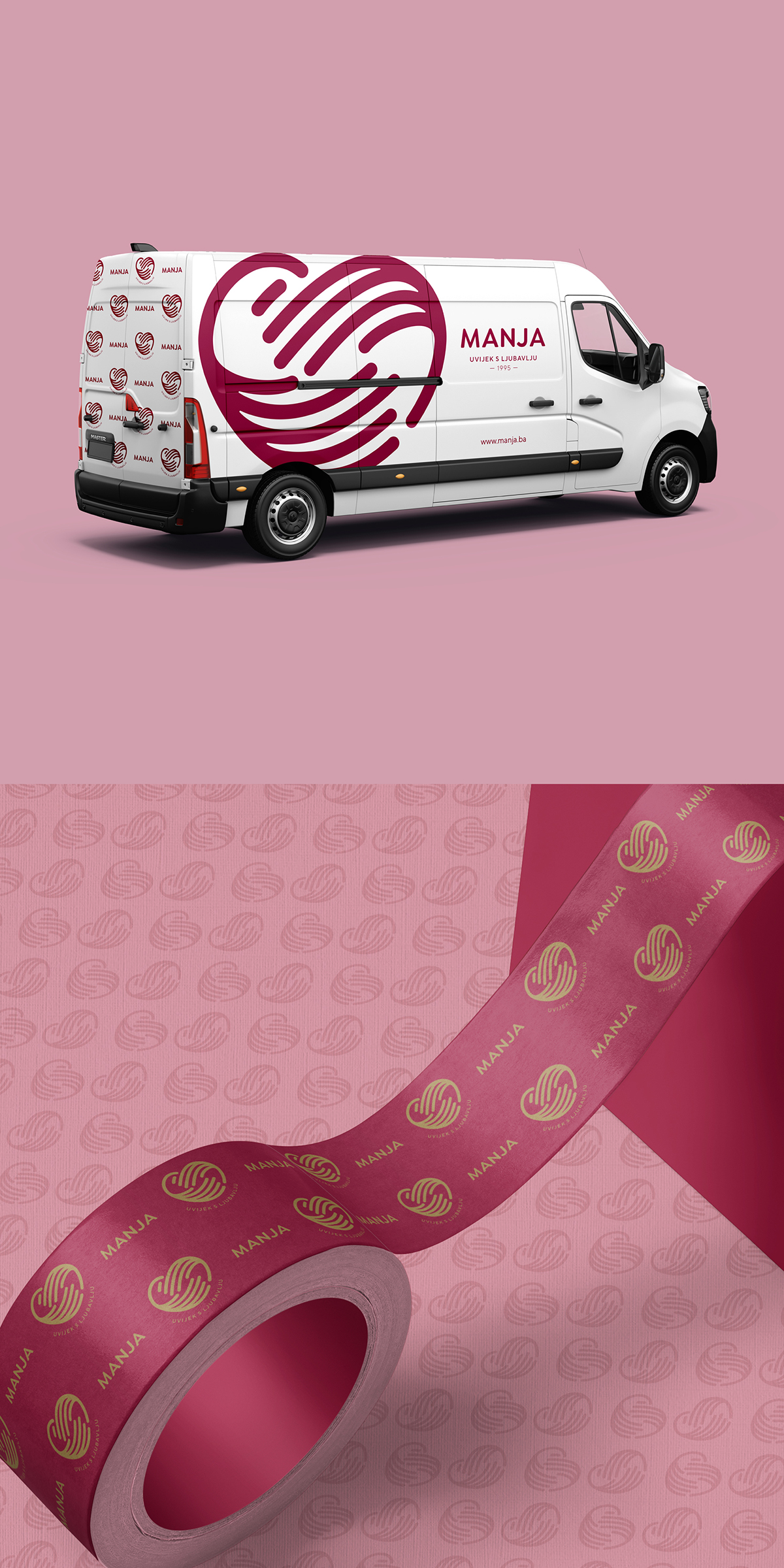
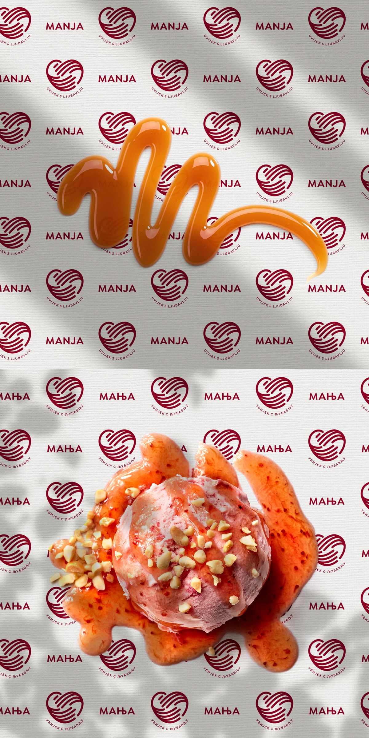
Manja visual identity
Client: Krajina Klas/Manja, Bosnia and Herzegovina
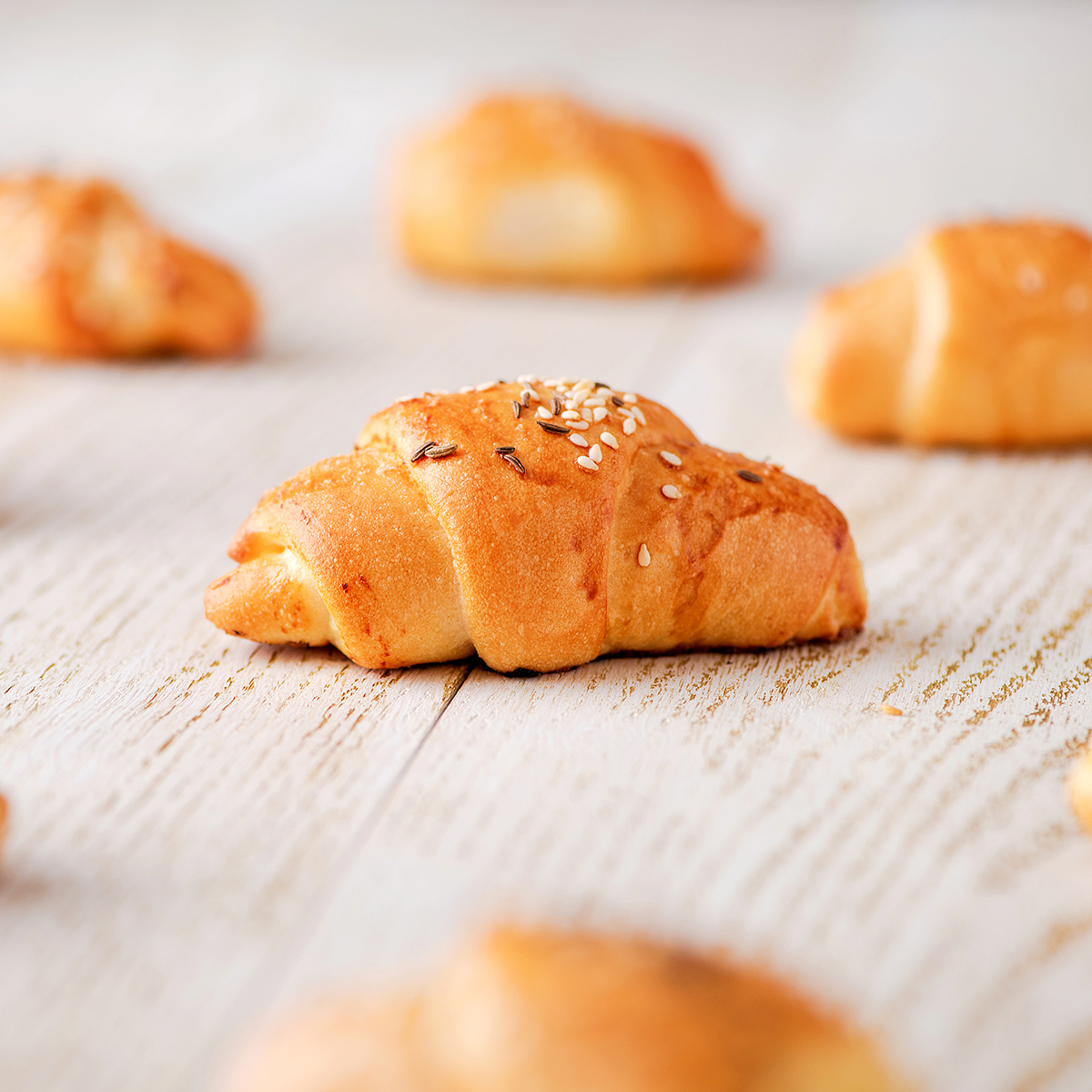
Manja is one of the most recognised names in the bakery-pastry family of products, and in their almost thirty years of presence, they have gone through several upgrades of their visual identity. Considering the changes in the market, the growth of production and the increased volume of production, the bakery Manja recognised the need to completely reposition itself and build a solid position with a new visual identity, a new approach through all communication channels and strengthen its position as one of the leaders on the market.
Our task was to convey the story of Manja in an engaging, simple, convincing way, to convey the level of success that did not happen overnight, to retell the story of persistence, ups and downs, of the desire to introduce new products to the market, but also to preserve the tradition of ancient, divine recipes, scents and tastes.
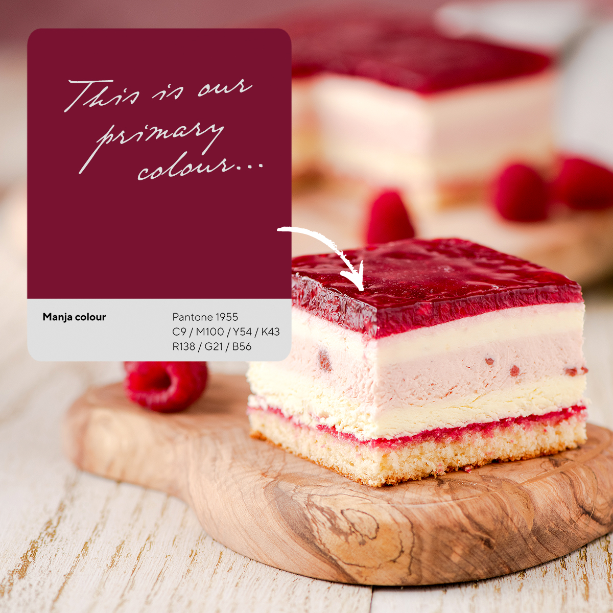
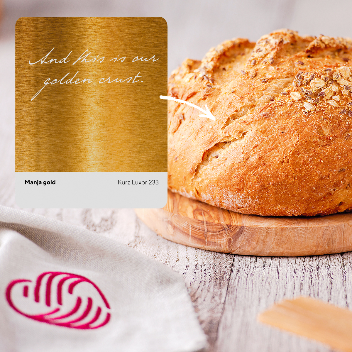
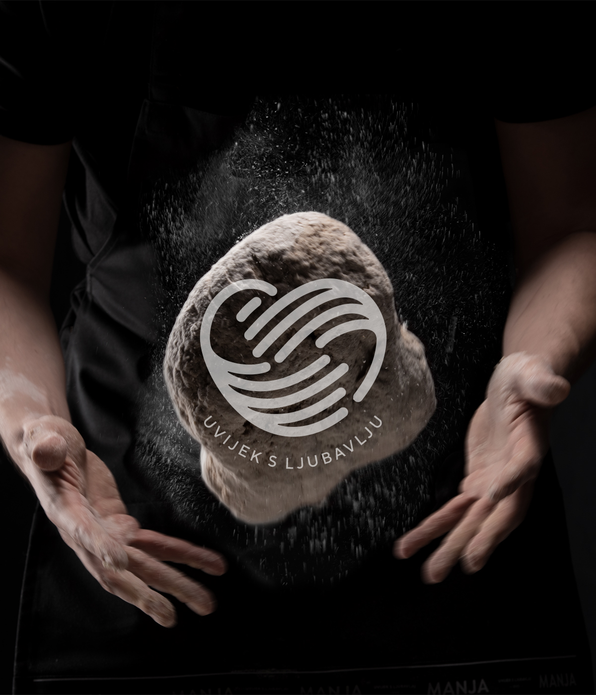
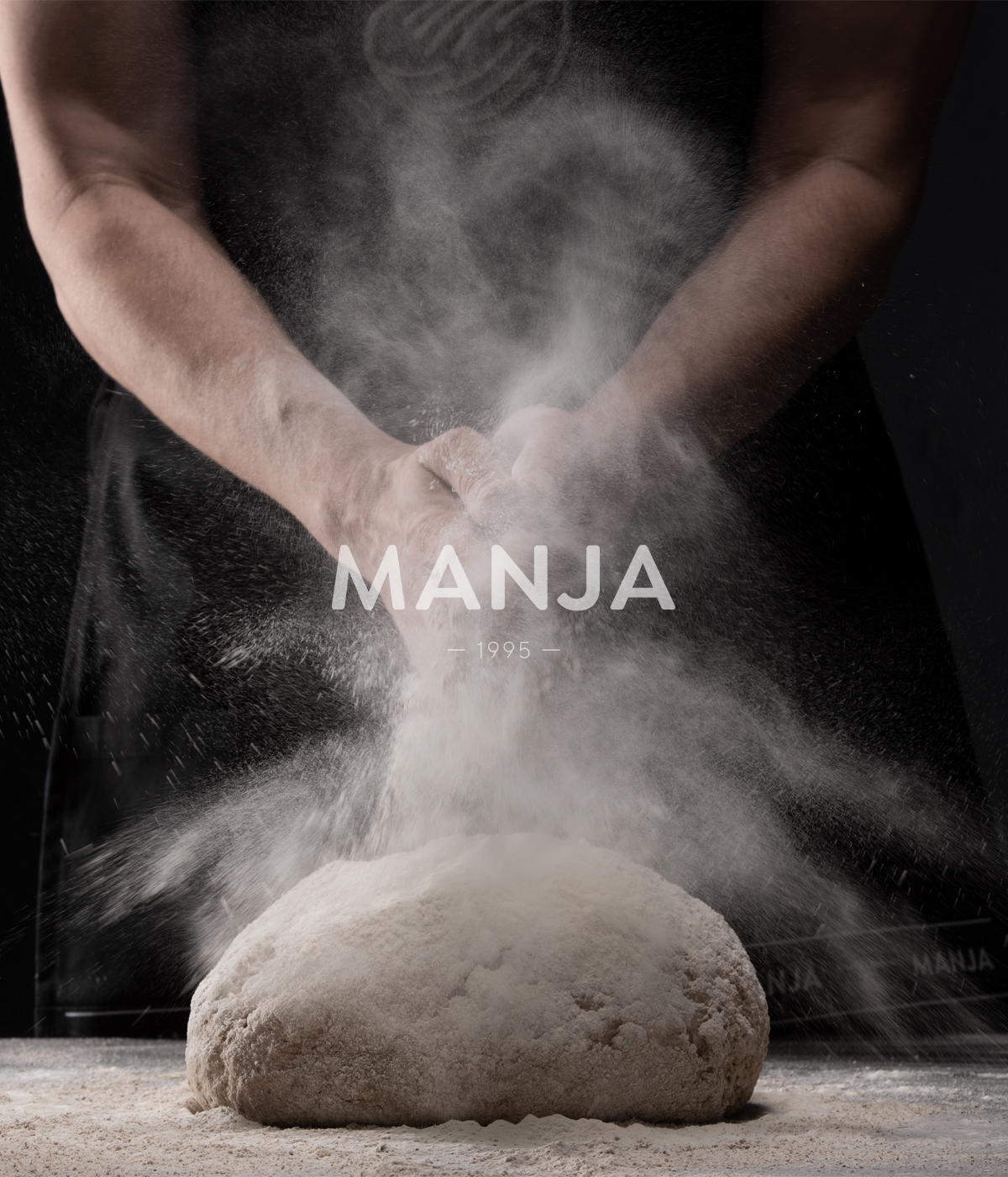
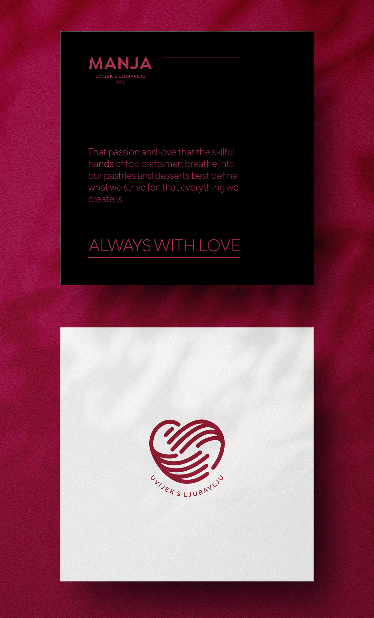
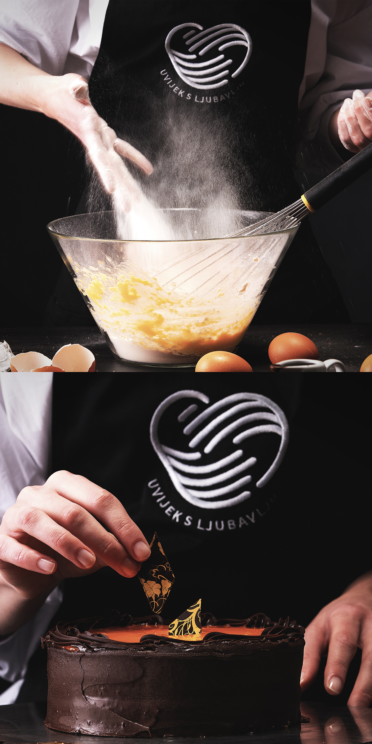
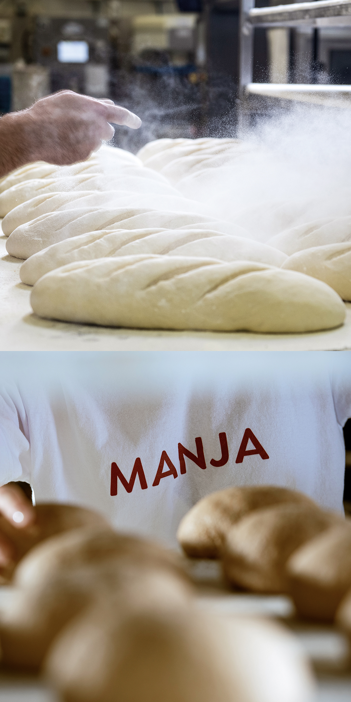
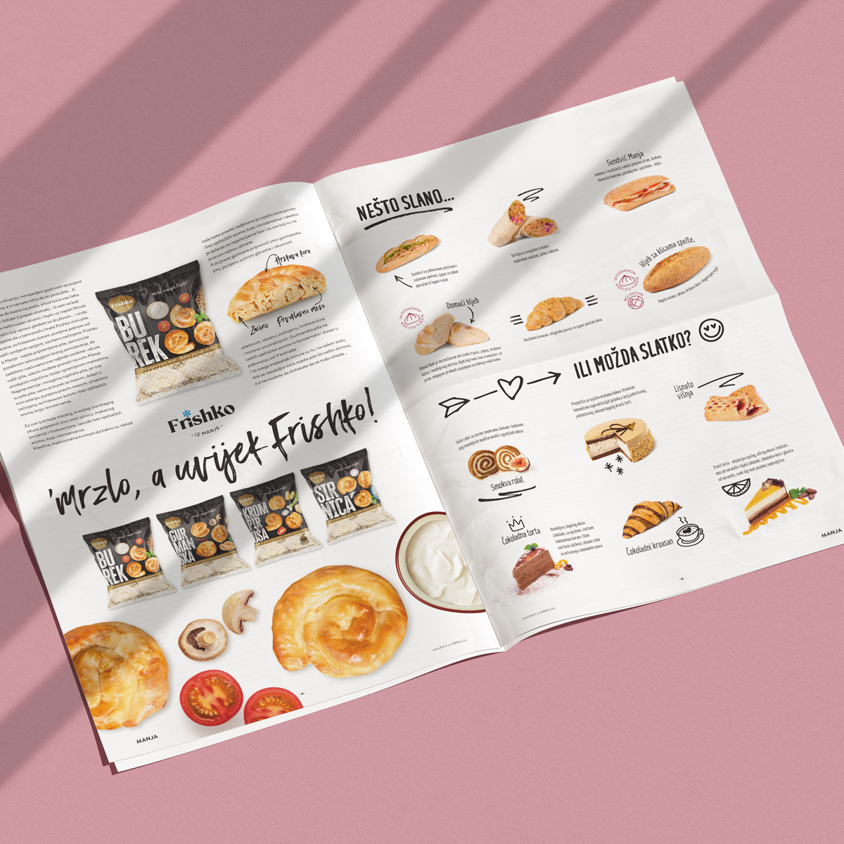
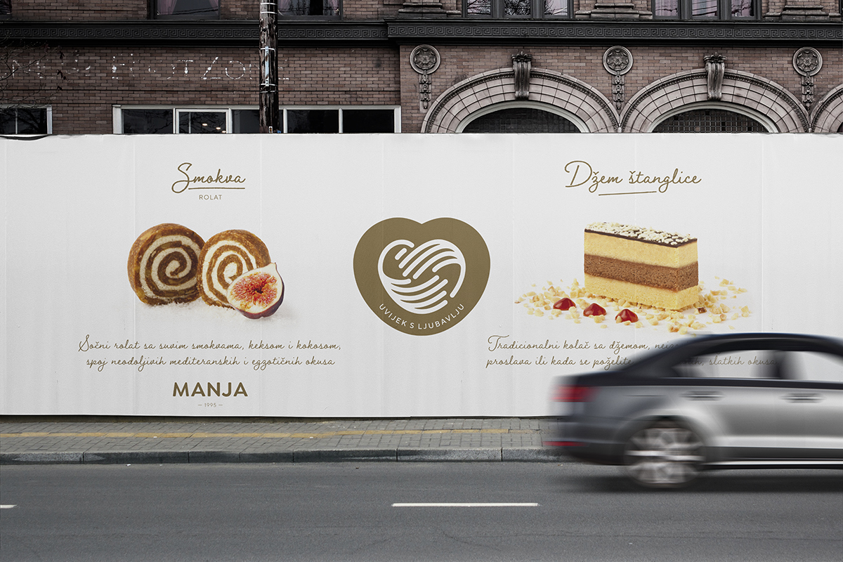
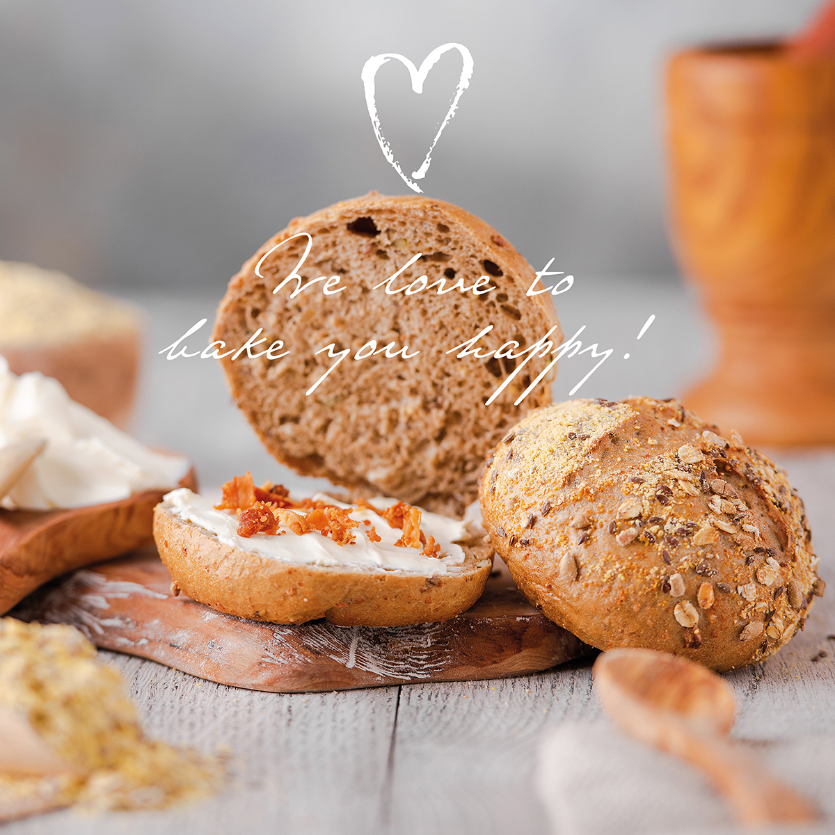
The basis of our story are hardworking, artisan hands that, filled with knowledge and love, can create the most incredible tastes, scents and shapes, hands that breathe passion and love into products, hands that everything they make, they make with love. And guided by these facts, we created the slogan and backbone of all our communication – Manja, always with love!
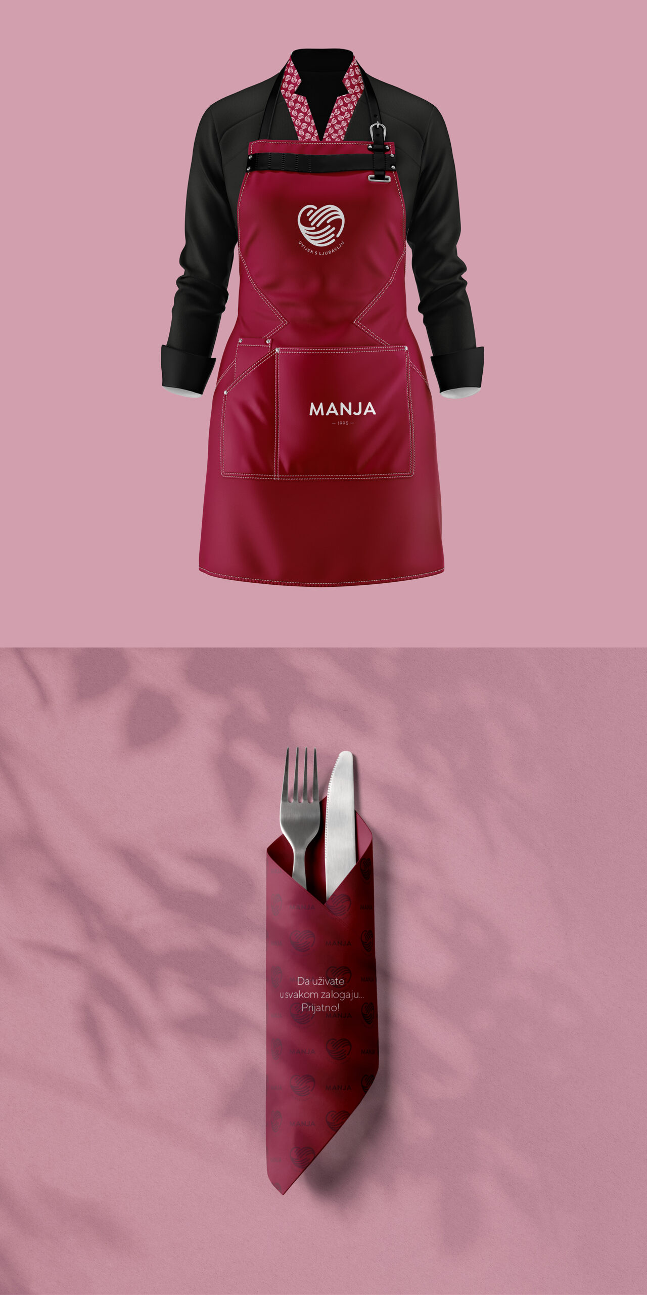
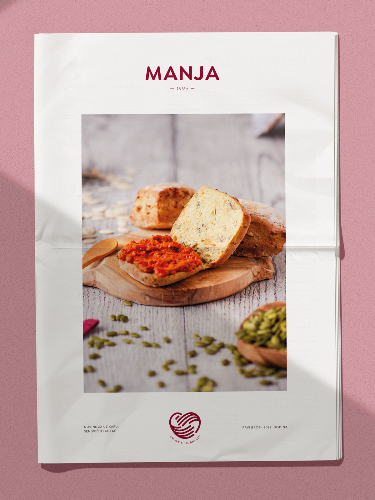
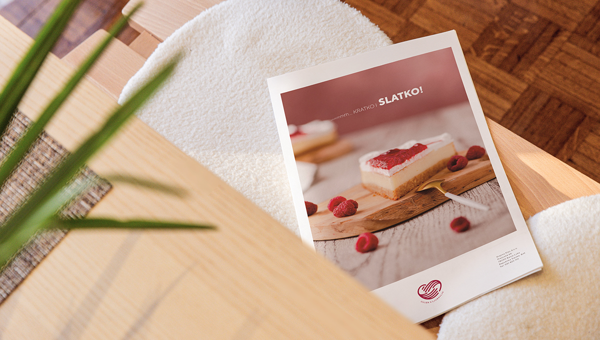
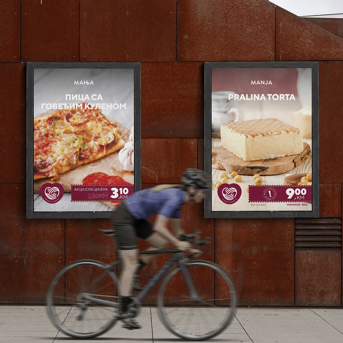
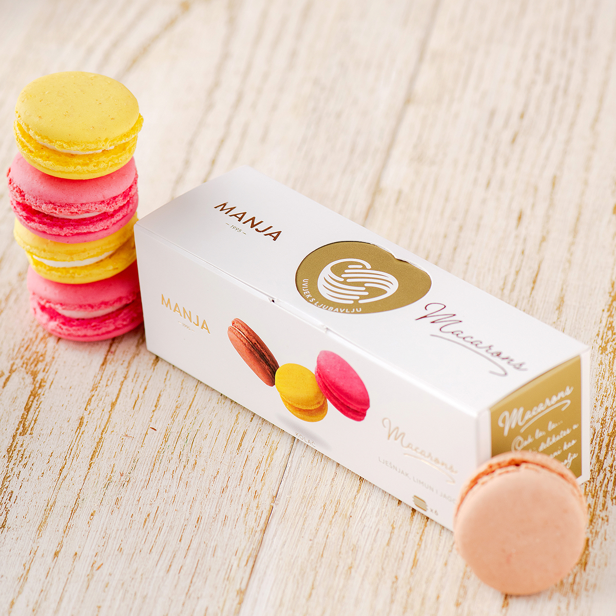
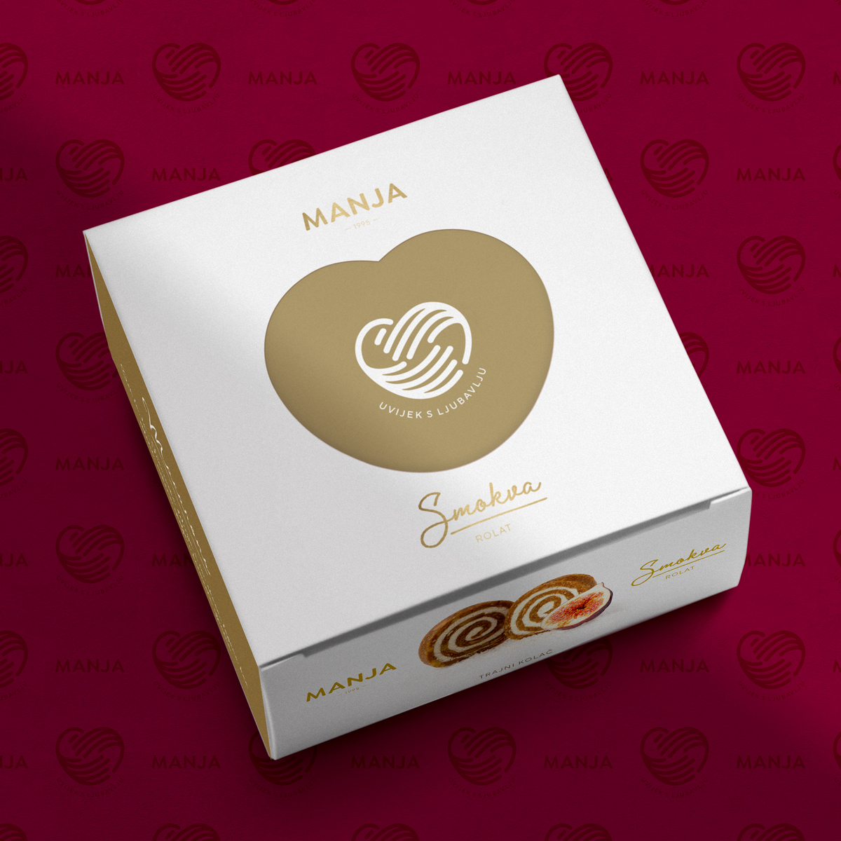
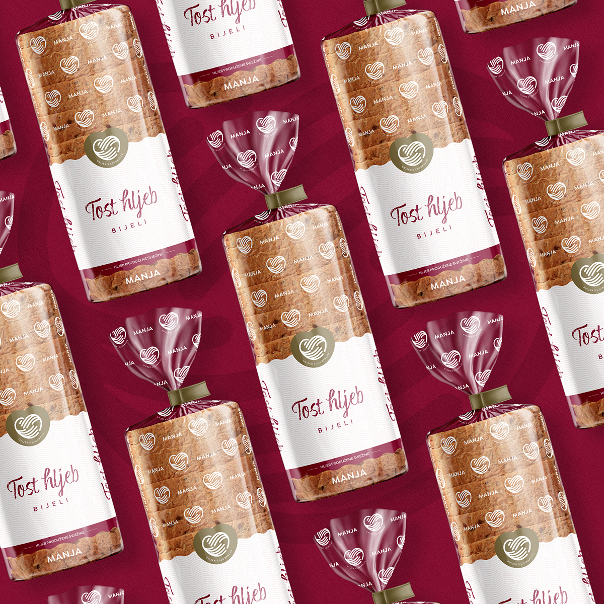
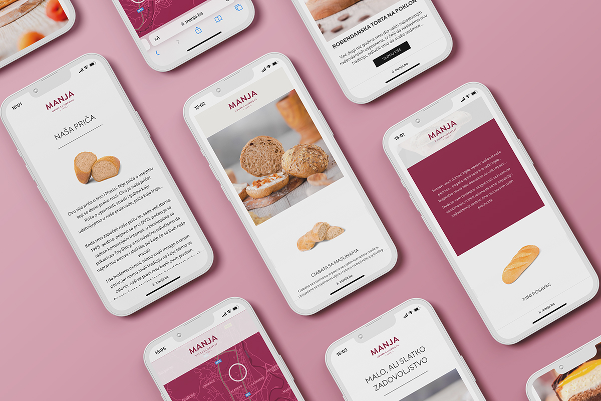
In addition to the visual identity, we also redesigned the complete narrative, the creation of new packaging systems, the implementation of the identity through all communication channels, and construction of digital communication channels, both through the website and through the improvement of social media networks.
And our story does not end here. Just as good dough needs time to mature and grow, so our story about Manja matures, grows and brings incredibly delicious results…
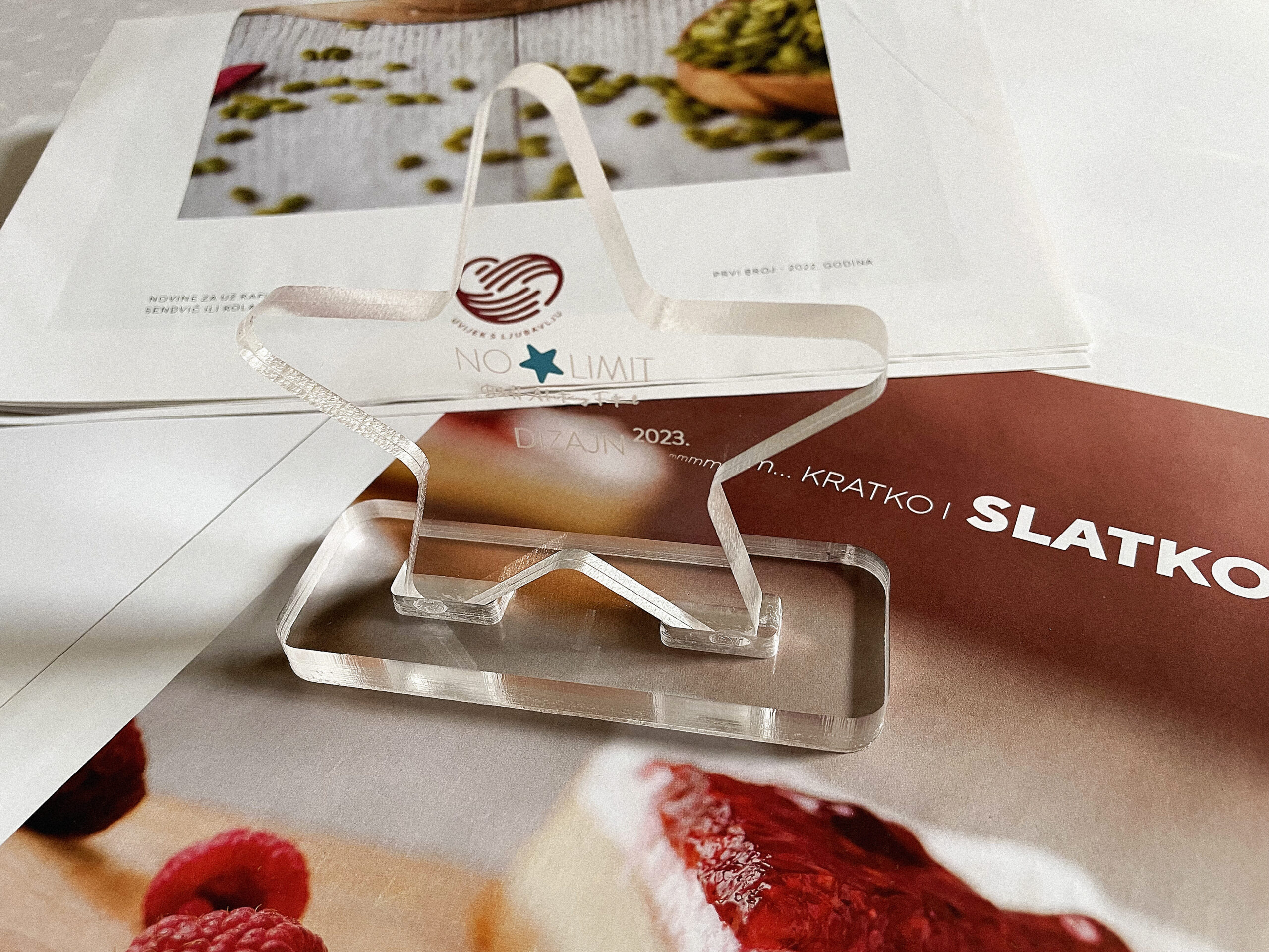
The recently held No Limit Advertising Festival in Sarajevo awarded the visual identity of the Manja bakery with gold in the Design – Graphic Design category.